If you’re a small business owner with a website, this video is a must-watch! In this video, we’ll show you exactly why this small business website is failing to attract customers. Keegan takes a deep dive into Oscar’s Eats, a local sandwich shop, and breaks down the major problems with their website—from unreadable menus to broken links and missing essential information.
If you own a small business, don’t make these same mistakes! A bad website can cost you customers and hurt your growth. Watch to see what went wrong and how to fix it.
Key Takeaways:
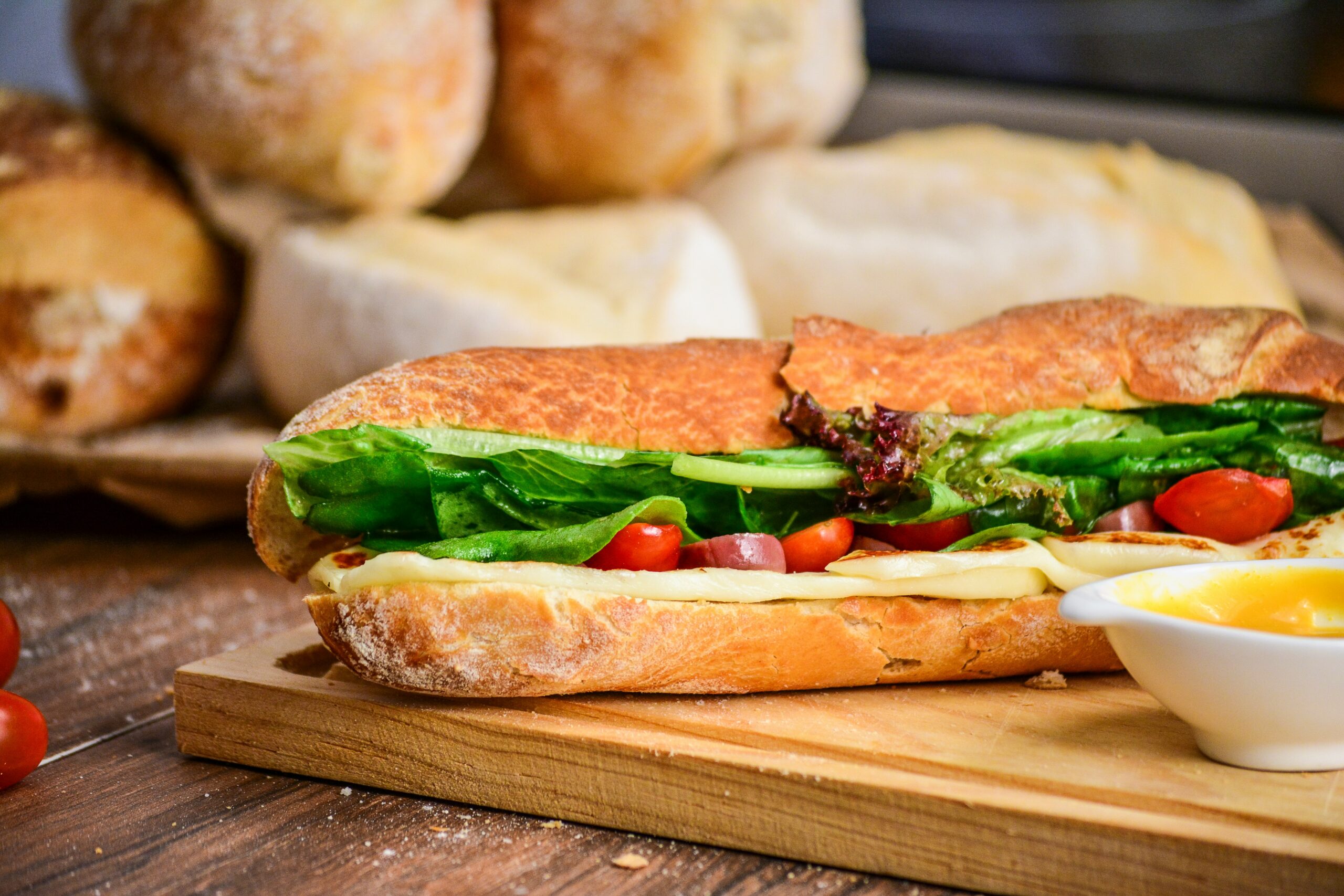
- Lack of Visual Appeal: The website is missing essential elements like pictures of the food, making it hard for customers to connect with the business.
- Menu Accessibility Issues: The menu is unreadable both on desktop and mobile devices, especially the small font and hard-to-read colors.
- Broken Links: Important links like Instagram and location aren’t functioning, which can frustrate potential customers.
- Poorly Organized Information: Key details like the location, hours, and contact information are buried or confusing, leading to a poor user experience.
- Need for Improvements: The website needs a clearer layout, working links, and more user-friendly design to attract and retain customers.
Video Transcript
I’m Keegan, and let me show you why I hate this small business website. Come on, Oscar! This is the website for Oscar’s Eats, a sandwich shop right nearby, and this website is doing them a huge injustice in attracting customers.
First of all, it’s a one-page website, which isn’t the worst thing in the world—one-page websites can be okay. The real issue here is that Oscar isn’t giving me the information I need to visit his business. They’re even trying to start a catering business, but the website is holding them back.
For example, check out this little Instagram link. At first, I might think, “Great, I can check out some pictures of their food!” But nope, the link doesn’t work. So, when a consumer comes here, they don’t see pictures of the food, they don’t get a sense of what the place is like, and the Instagram link is broken. That’s a huge missed opportunity.
Next, I see the menu, which is nice to have, but there are two major problems. First, I can’t even read it on my desktop. It’s hard to see because the colors—green on green on beige—make it almost impossible to read for most people. And the second problem: the majority of your traffic is going to come from mobile users. Let me show you what happens when I inspect the site on mobile. Look at this! The text is so small, it’s almost impossible to read. This is a major issue for people trying to decide if they want to eat there. Even an ant couldn’t read that!
Now let’s scroll down. The location is buried at the bottom of the page, and it’s not even a hyperlink to Google Maps. There’s no call to action for the phone number, and clicking it doesn’t open up the dialer. It’s the same with the email—clicking the email doesn’t do anything. And then the hours listed are confusing: 8 a.m. to 4 p.m., with “breakfast after dark.” What does that mean? Does it mean they’re open, or not? Does it mean part of the menu is only available after dark? This should be much clearer.
Oscar, give your customers more information. I really don’t like this website. It has a color scheme that doesn’t work, an unreadable menu, and important features like links and contact information that don’t function properly. This website could be so much better at getting customers for you.