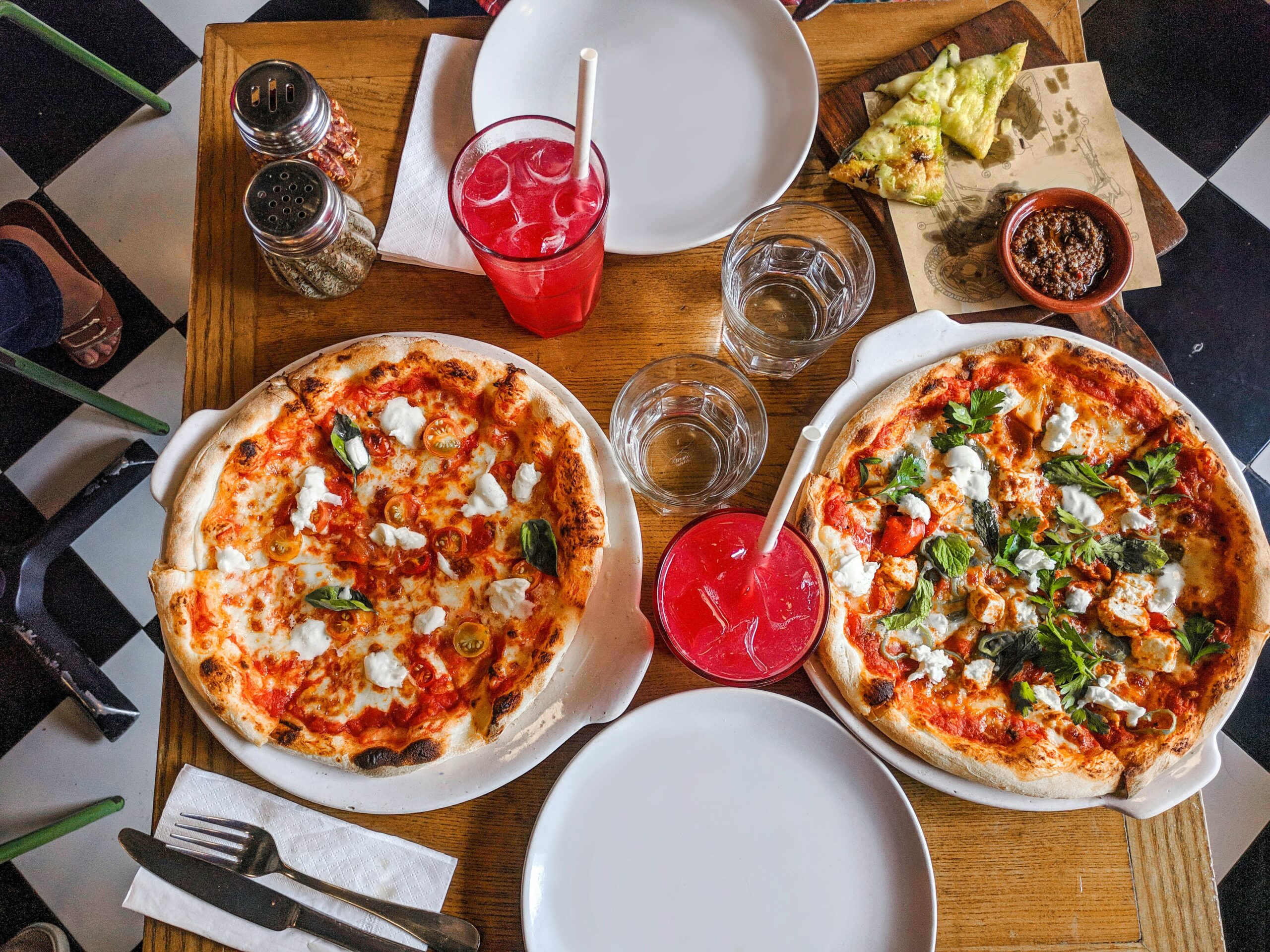
A great pizzeria website can attract more customers and boost sales, but common mistakes can drive them away.
In this video, we break down what makes a great pizzeria website and the common mistakes to avoid! If you own a pizzeria or you’re building a website for one, this is a must-watch.
We review a pizzeria website and highlight what works well, such as Google Maps integration, customer reviews, and an organized menu. We also point out what’s missing, including a logo, social media links, and high-quality images. Finally, we share quick fixes to make your pizzeria website look more professional and convert more customers!
Key Takeaways:
- A pizzeria website should have a professional design, including a logo and clear calls to action.
- Showcasing high-quality food images and customer reviews can enhance the site’s appeal.
- Social media links, like Instagram and Facebook, are important to connect with customers.
- A well-organized menu and location information, including Google Maps, are essential for easy navigation.
- Finishing the website with complete content and updated photos helps improve professionalism.
- Incorporating Instagram feeds and using tools like Elfsight can make the website more dynamic.
Video Transcript:
If you own a pizzeria or are building a website for one, check out this video! Today, I’m reviewing Carl’s Pizza’s website to see what works and what could be improved.
First off, I actually like a lot of things about this site. However, the design could definitely be better. One thing I don’t like is the use of sliders with no calls to action. These sliders don’t tell visitors anything about the business or encourage any engagement. It would be nice to have something like “Denver’s Finest Pizza” to introduce the pizzeria.
Another problem is that the website just says “Carl’s Pizza” with no logo in the top left corner. A website without a logo looks unprofessional and amateurish. Think about how Apple or car dealerships always feature their logo—it’s the same idea.
Scrolling down, I noticed a great feature: Google Maps integration, which is an excellent move. This makes it easy for customers to find the pizzeria’s location. Additionally, the website includes a lot of text on the homepage, which is a good thing, as it provides more context for the business. They also encourage people to leave reviews, which is smart because more reviews improve the website’s credibility on Google, helping the pizzeria show up in search results.
However, there’s a missed opportunity here: no links to Carl’s Pizza’s Instagram or Facebook page. Customers like to check out a business’s social media to see more pictures of the food, customer interactions, and the overall atmosphere. Adding those links could significantly improve the website’s engagement.
The menu is well-organized and easy to read, which is important. However, some of the food images are not ideal—like the half-eaten food picture. They could replace that with a more appetizing image. I also noticed unfinished content on the site, like incomplete photos. If the pizzeria offers soup, for example, showing a picture of the soup would give customers a better idea of what they’re ordering.
The location page is okay, but I’d recommend embedding the Google Maps feature directly in the content instead of just in the footer. Also, it’s a bit confusing that there’s another location link in the middle of the page. It would be clearer if the location details were prioritized on the page.
The “Our Customers” section is fine, but it’s redundant because there are already reviews displayed on the homepage. If I were making improvements, I’d add a logo, use a more professional hero image, and add social media links. The reviews are great, but they could also integrate a Google Business profile. Also, it would be helpful to have a page dedicated to showing what the restaurant looks like—inside and out—so customers know what to expect when they visit.
One final tip: if they have an Instagram account, I’d recommend using a tool like Elfsight to integrate an Instagram feed directly into the website. It’s much easier to upload food and restaurant pictures to Instagram and have them appear on the website automatically, keeping things fresh and engaging.
Overall, Carl’s Pizza’s website is a good start but could be improved with a few simple changes. If you need help building a professional, affordable website, Mighty Local can create one for you for just $99 a month. Contact our sales team today to learn more!


